Vision is one of the most dominant senses in humans. Our brain processes visual stimuli in the form of movement, color, contrast, and depth. These stimuli are integrated by the visual cortex to render a coherent view of the scene. Our visual system works so seamlessly that we rarely pause to think about how it functions. However, once in a while, we encounter scenarios that highlight the biases and limitations of our visual perception.
In this blog, we will explore biases in visual data and how they translate to issues in machine learning model performance. We will discuss the use of synthetic data in offsetting data bias, the challenges associated with synthetic data, and how to use FiftyOne to compare it to real data for identifying possible domain gaps.
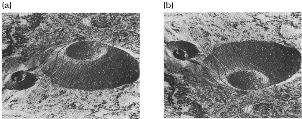
To discuss visual bias in human vision, let’s look at the classic example shown in the images below. In image (a), you may see a small crater on top of the mound, but in image (b), you may see a crater with a small mound at the bottom. In reality, image (b) is simply an inverted version of image (a), mirrored along the horizontal axis. So why does this happen? The reason is that we assume the source of illumination is coming from the top. If you look at image (b) again and tell your brain that the source of illumination is at the bottom, you may be able to visualize the flip. Remember, image (b) is just a mirrored version of image (a) along the horizontal axis.
Another common phenomenon showing the biases of the human visual system is the Thatcher effect, wherein it is difficult to detect distortions of facial features when the face is upside-down. This is because the fusiform face area of the brain, which some researchers believe to be responsible for face perception, is more sensitive to featural information than configural information when processing inverted faces. Other such examples may include prosopagnosia—a cognitive condition that makes it difficult for some people to recognize faces, and the existence of super-recognizers—people who are remarkably good at face recognition. I am not a neuroscientist, but these phenomena spark my curiosity as a computer vision engineer. Like many others in the field of vision and imaging, I also take an interest in drawing parallels between the human visual system and deep learning models. If we apply geometric transformations to the dataset used to train our brain’s facial recognition network, would that make the fusiform face area less orientation sensitive? If we see more inverted faces, can we overcome the Thatcher effect? Perhaps.
Visual AI models in humans have evolved over centuries but are not immune to biases and limitations. Some of these biases and limitations can be attributed to the distribution of data to which these models are exposed. This is also true for machine learning models trained on biased real-world data. Common ways to overcome data bias are collection, augmentation, and/or synthetic generation. Let’s delve into synthetic data generation and what are some of the important things to consider when using synthetic data in machine learning model training.
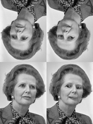
The Thatcher effect, demonstrated on a photo. Image source: Wikipedia
Simulation—the double-edged sword
Training computer vision models requires large quantities of data, which can come in the form of images, videos, point clouds, and meshes. However, capturing and processing real-world data is often expensive and time-consuming. Additionally, real datasets can suffer from limited variations and categorical imbalances. This is where synthetic data comes in—it can help offset these problems and offer a cost-effective alternative to adding more training data. However, we need to scrutinize the synthetic data pipeline to ensure representativeness and diversity and avoid bias amplification.
Synthetic data is artificially generated data that can be created using rendering engines such as Blender or Unity, or by using deep generative models such as GANs or Diffusion models. For real-world data simulations, these renderers/generators must capture the features of the scene as well as the characteristics of the processing pipeline. For instance, a good image generator simulates the color, texture, size, and shape features of the scene while also accounting for the noise and constraints of the imaging pipeline, outputting a realistic image. However, there may be times when our synthetic data looks like real data in the spatial domain but contains artifacts in the frequency domain. This may undermine model performance as deep learning models are often sensitive to features that are not visible to the human eye.
While there are instances of models trained on synthetic images surpassing the performance of those trained on real images, synthetic data doesn’t always improve model performance. We need to analyze how a machine learning model interprets training data and use that information to generate better synthetic data. Synthetic data should suppress existing biases in real data without introducing new ones into the data distribution. Metrics such as Fréchet Inception Distance (FID) are commonly used to compare the distribution of synthetic images against real images. However, FID doesn’t provide clear, actionable insights into improving the synthetic data.
In the next section, we will use FiftyOne to compare complex features in the embedding space for datasets combining real and synthetic images, apply dimensionality reduction, and visualize the results. We will also discuss how to draw insights from these visualizations.
Real vs synthetic images
In this analysis, we are going to use two datasets containing a combination of real and synthetic images: the CIFAKE dataset and a dataset containing real and generated faces. Using FiftyOne, we will show you how easy it is to compute CLIP embeddings for each of these datasets, use UMAP for dimensionality reduction, and visualize the results in the embeddings panel.
CIFAKE
CIFAKE consists of 60,000 real and 60,000 synthetic images. The real images are taken from CIFAR-10, with 50,000 training and 10,000 test images. The synthetic images are generated with Stable Diffusion v1.4 to mirror the categorical distribution of real images in CIFAR-10. Each synthetic image belongs to one of the 10 classes in CIFAR-10, and for each class, there are as many synthetic images as real images in CIFAKE. Please note that CIFAKE doesn’t provide image class labels and only categorizes samples as real or fake.
Here’s FiftyOne code to compute CLIP embeddings for CIFAKE and visualize them after UMAP dimensionality reduction:
import os
import fiftyone as fo
import fiftyone.brain as fob

# Install the required packages.
!pip install -U torch torchvision fiftyone umap-learn open_clip_torch

# Download CIFAKE dataset to a local directory: https://www.kaggle.com/datasets/birdy654/cifake-real-and-ai-generated-synthetic-images
dir_path = "path/to/cifake_dir"

# Load CIFAKE train split as a FiftyOne dataset.
dataset_train = fo.Dataset.from_dir(
   dataset_dir=os.path.join(dir_path, "train"),
   dataset_type=fo.types.ImageClassificationDirectoryTree,
   name="cifake_train",
)

# UMAP with CLIP embeddings.
fob.compute_visualization(
    dataset_train,
    embeddings="clip_embeddings",
    method="umap",
    brain_key="clip_umap"
)

# Launch the FiftyOne app and open the embeddings panel.
session = fo.launch_app(dataset)

# Repeat the above for CIFAKE test split (dataset_test).
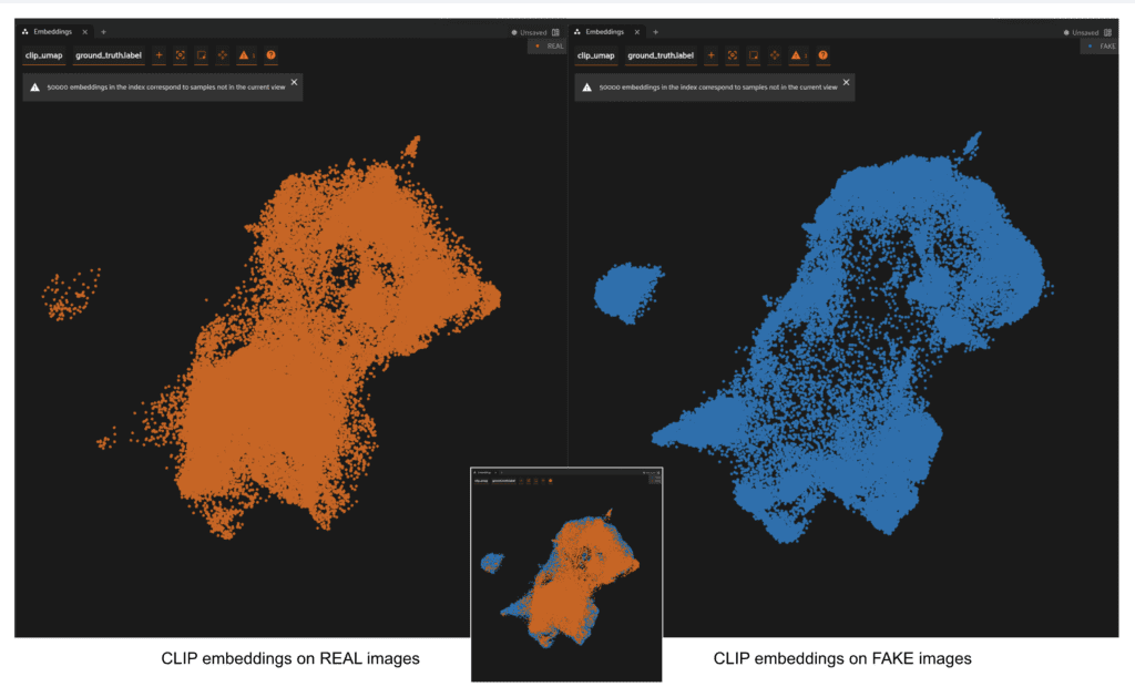
Embeddings computed and visualized for CIFAKE train split using FiftyOne
For CIFAKE, the distributions of CLIP embeddings for real and synthetic images overlap in the 2D UMAP visualization. However, the synthetic embeddings are not as concentrated as real embeddings in the interior regions. We also see a separate cluster composed mainly of fake embeddings. In order to analyze the small cluster of points on the left in CIFAKE, we start by lasso-selecting in the FiftyOne Embeddings panel and looking at the corresponding images in the Samples panel.
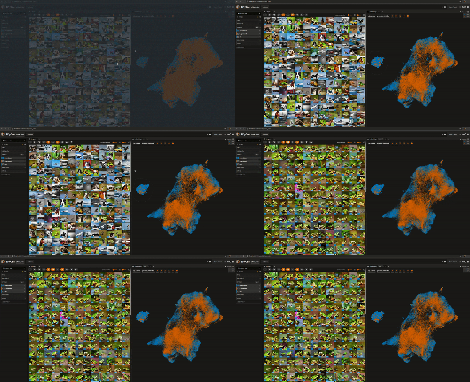
We can then filter the selected samples using FAKE and REAL ground truth labels and view them in the Samples panel, as shown here:
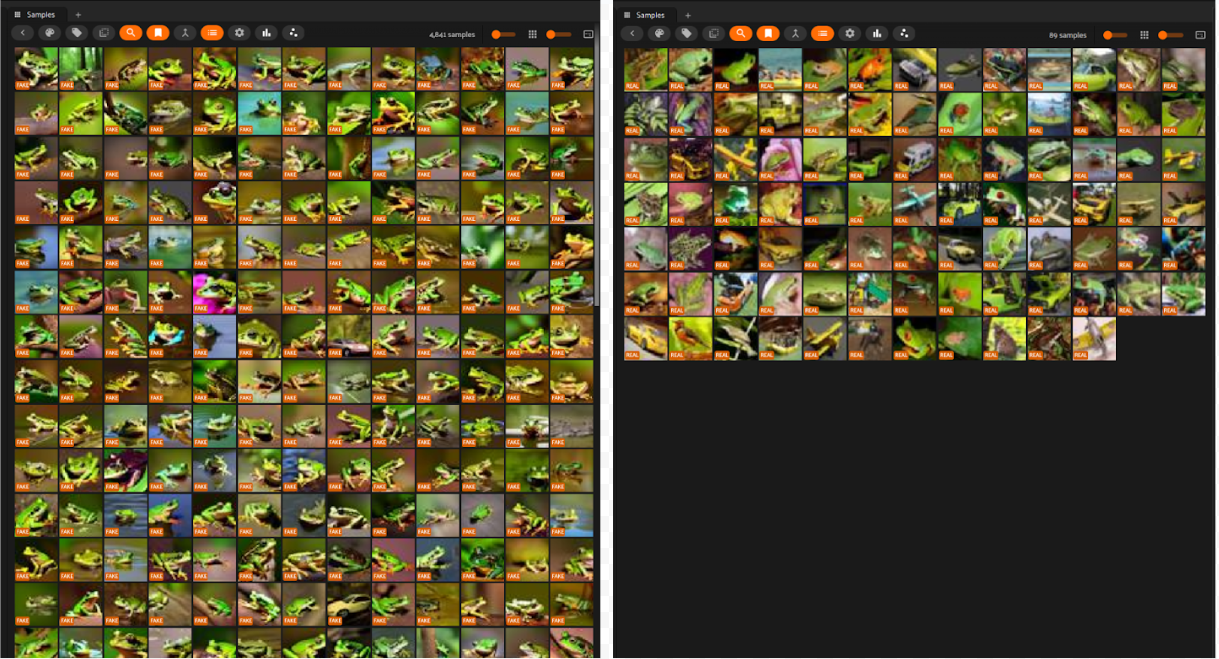
There are 4930 samples in the cluster, of which only 89 are real, and the rest 4843 are synthetic. While CIFAKE doesn’t provide classwise labels, we can see that all of the 4843 synthetic samples are of green frogs. This means that there are 157 synthetic frog images, along with ~99% of real frog images not present in this small cluster.
Now, let’s generate the same visualization for the CIFAR-10 train split, the subset of the CIFAKE train split that exclusively contains real images. The image below shows what CIFAR-10 train split CLIP embeddings look like when plotted in 2D after UMAP reduction in the Embeddings Panel in FiftyOne. We see that the embeddings from one class cluster together (with some outliers).
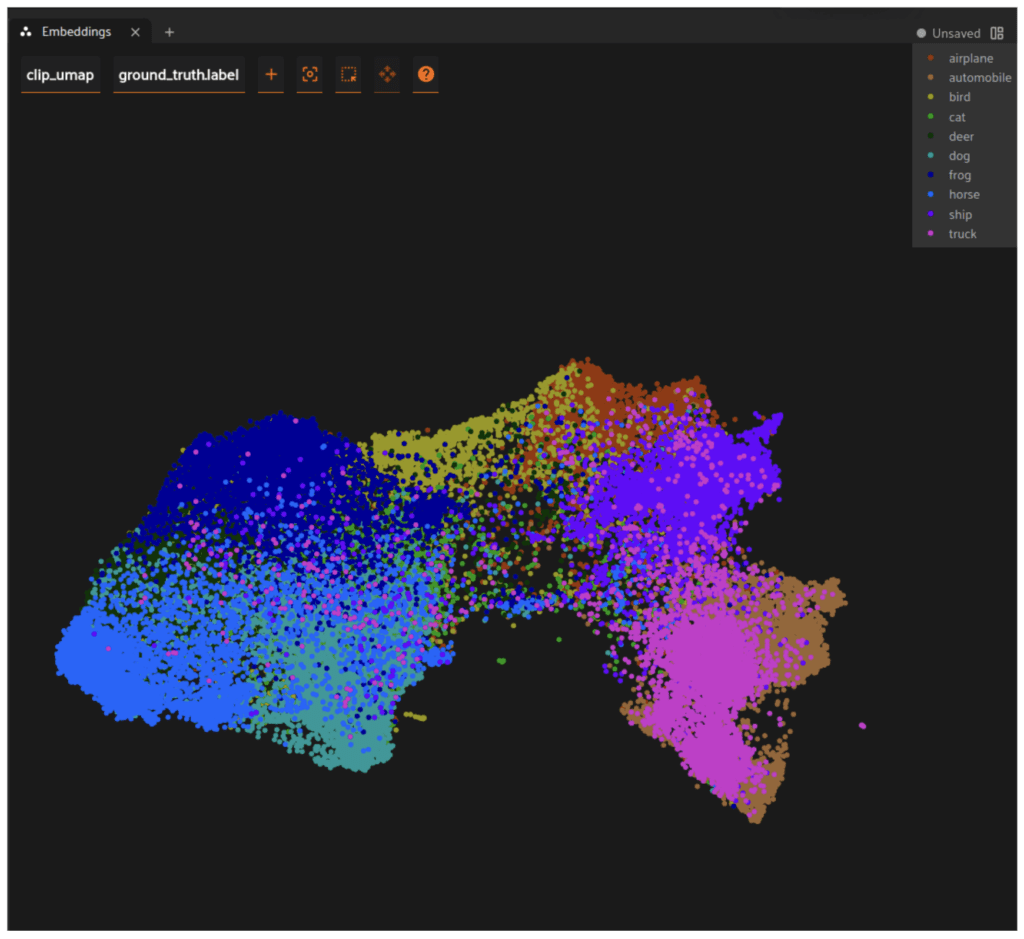
If we look at the frog samples in CIFAR-10, they seem to fall close to each other, indicating feature correspondence. This is in contrast with our observations in CIFAKE for frog samples.
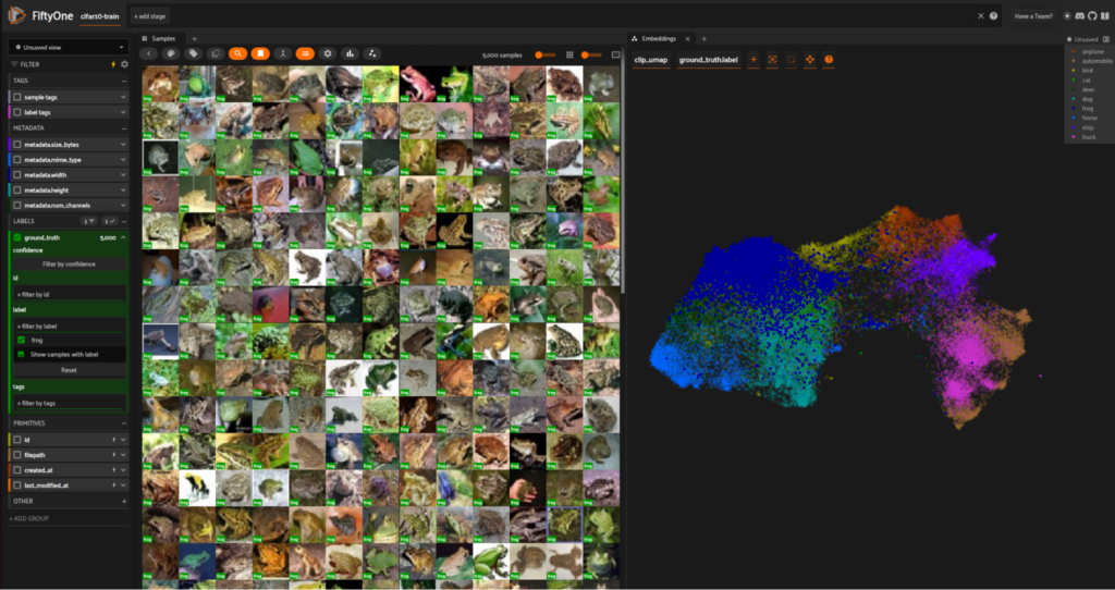
frog samples (left) and corresponding embeddings shown in the darker blue (right) for cifar10_train in the FiftyOne AppBased on the above, we can infer that real and fake frog embeddings don’t seem to cluster together in the CIFAKE train split. This lack of feature overlap indicates that the incorporation of synthetic data has introduced a bias in frog samples.
If we had image classification labels in CIFAKE, it would be interesting to study the correlation between the distribution of real+fake embeddings for a class and classification metrics. While we can’t do that, let’s try zero-shot classification on the CIFAKE test split using the OpenCLIP model (you can also use the train split for this).
import fiftyone as fo
import fiftyone.zoo as foz

# Classify CIFAKE test split into CIFAR10 classes using CLIP.
clip = foz.load_zoo_model(
    "clip-vit-base32-torch",
    classes=["airplane", "automobile", "bird", "cat", "deer", "dog", "frog", "horse", "ship", "truck"]
)
dataset_test.apply_model(clip, label_field="clip")
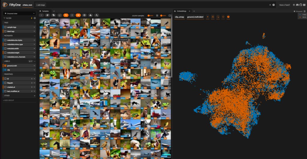
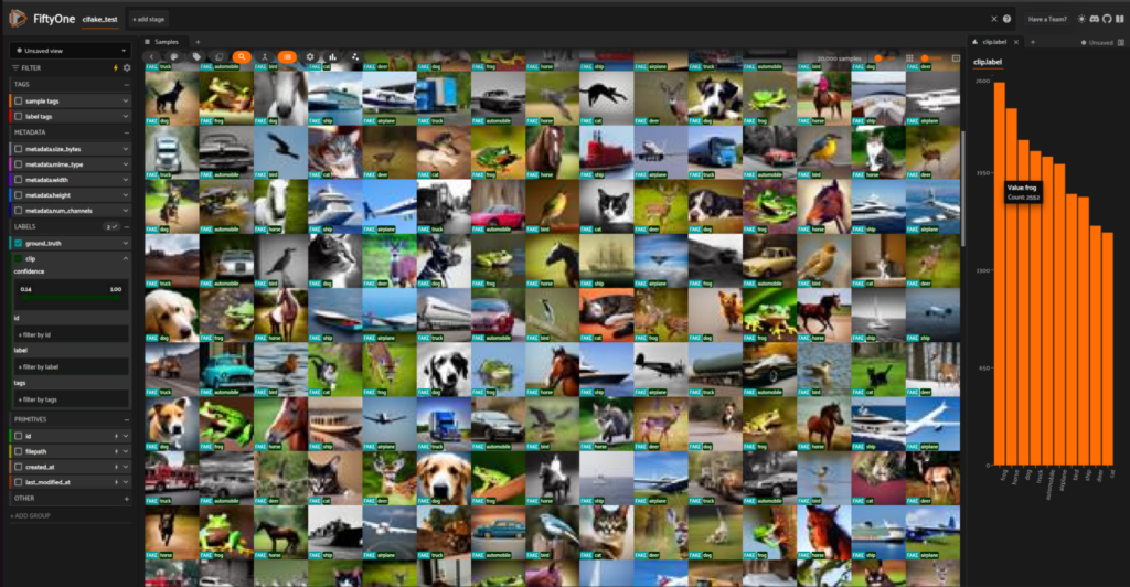
In the FiftyOne Histogram panel, we can see the label count for each of the CIFAR-10 classes. Our zero-shot model classified 2552 out of 20,000 test samples as frog, where 1332 predictions are for REAL images, and 1220 are for FAKE images. We know off the bat that there are at least 552 misclassifications since CIFAKE only has 2000 frog samples.
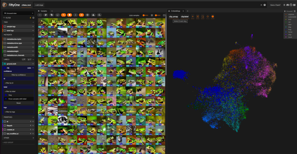
frog samples (left) and embeddings lasso-selected by frog class (right) for cifake_test in the FiftyOne AppFurthermore, let’s look at frog samples with a high CLIP prediction confidence. For confidence in the 0.7-1.0 range, there are only 1356 samples, of which 963 are FAKE, and 393 are REAL samples. Also, upon visual inspection in FiftyOne’s Samples panel, we notice that most of the frog misclassifications are for real samples. Is the model biased toward green frog samples? Can the segregation between real and fake frog samples in the 2D embedding space explain this?
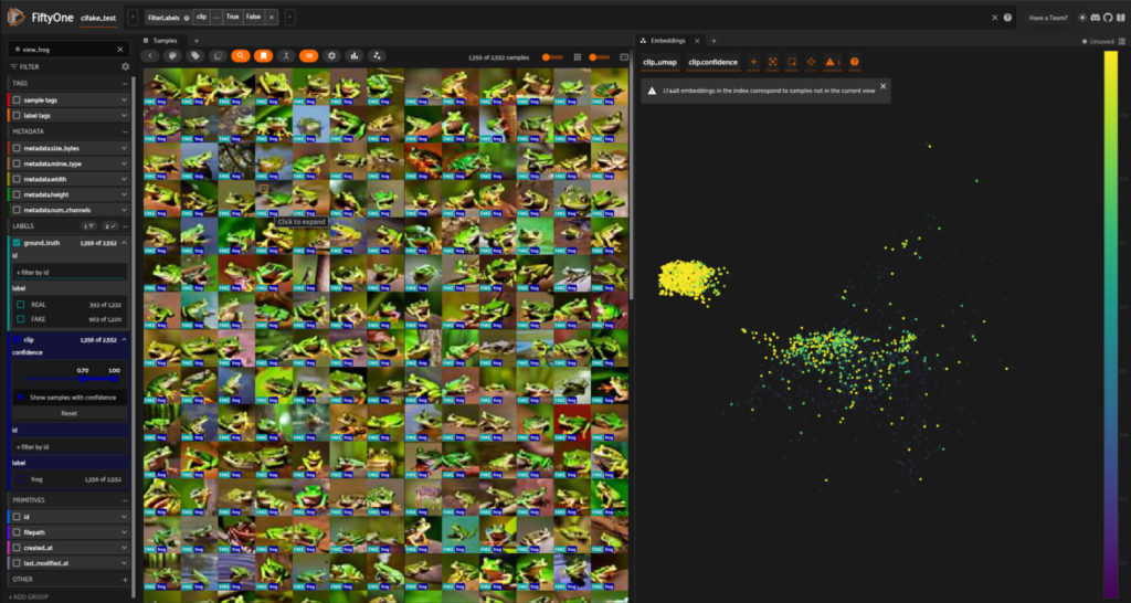
frog samples for cifake_test with clip.confidence > 0.7 in the FiftyOne AppBased on the above observations, we can see a relationship between zero-shot CLIP classification and embedding distribution in the UMAP space. It is intriguing to see CLIP predictions biased towards green frog samples. While it is difficult to do an in-depth analysis without inspecting the CLIP training dataset, the skewed model performance may be a manifestation of bias in frog training samples for the CLIP model.
Real vs fake faces
The second dataset for this analysis uses 70,000 real faces and 70,000 GAN-generated faces. We repeat the same computations and visualizations as with CIFAKE.
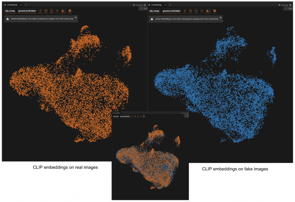
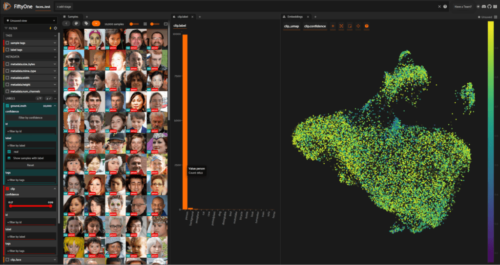
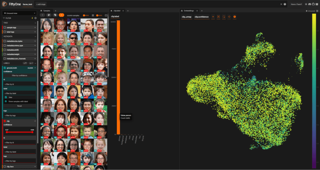
For this dataset, we can see that the real and fake embeddings are distributed similarly in the 2D UMAP space. This indicates that synthetic face samples are representative of real face samples and haven’t induced any new biases in the distribution. When we use the OpenCLIP model for zero-shot classification on this dataset, there is no significant difference in the predicted labels. For real images, 9,822 out of 10,000 samples are labeled as person, and for synthetic images, 9,985 out of 10,000 samples are labeled as person. Researchers have found that AI-synthesized faces are indistinguishable from real faces, and interestingly, this is also reflected in the embedding space and CLIP predictions for the real+synthetic face dataset under consideration.
Conclusion
The ultimate goal of incorporating synthetic data into training is to enhance model robustness. Whether you combine synthetic data with real-world datasets or train exclusively on synthetic data, the end result should be improved model performance. While real-world data bias is a pervasive issue, it can be mitigated by balancing underrepresented categories or introducing controlled diversity via synthetic data. UMAP reduction and visualization of higher dimensional embeddings are useful in understanding feature representation in synthetic data against real data. They are not only important tools for identifying trends and outliers in real data but also for assessing the features captured in synthetic data and how well the synthetic data balances the out-of-distribution real samples. By carefully managing the complexities of data distribution, synthetic data can be a powerful tool for reducing bias in data and machine learning models.
If you have a data simulation pipeline that generates, for instance, training images with class labels, you can train a classification model, look at the evaluation metrics, compare performance against models trained exclusively on real data, and draw insights from the UMAP reduction and visualization of real+synthetic samples. Based on these insights, you can tune your simulation pipeline to generate synthetic data that improves model performance. FiftyOne makes it easy to load your data and evaluations, compute image embeddings, and visualize them in the embeddings panel. To get started, install FiftyOne and explore the multitude of tools for analyzing visual data. Join the Discord community to keep up-to-date with the latest releases and participate in Visual AI discussions.

