A Complete Annotation Workflow with FiftyOne
Author

Hacker-in-Residence
Harpreet is Hacker-in-Residence at Voxel51, where he turns cutting-edge AI ideas into open-source prototypes and demos that push the boundaries of deep learning. From building tools that inspire to creating content that educates, Harpreet helps the AI community level up—one wild idea at a time.
See all articles by Harpreet Sahota
In this article
A 30-second FiftyOne primerKey takeawaysThe pool, honestlyStep 0: Download and stage the datasetStep 1: Load the dataset and verify it’s unlabeledStep 2: Compute embeddings with CLIPStep 3: Find and tag near-duplicate imagesStep 4: Visualize the pool with UMAPStep 5: Test text-based similarity searchStep 6: Search with a few labeled examples instead of a wordStep 7: Try a second embedding backbone: C-RADIOStep 8: Prioritize what’s left with all four signalsStep 9: Annotate in the FiftyOne AppStep 10: Fine-tune a detector with RF-DETRStep 11: Spot-check the model on what it hasn’t seen yetStep 12: Evaluate against the held-out labelsOne more thing: Agentic Labeling with Voxel51Try it yourselfFrequently Asked Questions
In this article
A 30-second FiftyOne primerKey takeawaysThe pool, honestlyStep 0: Download and stage the datasetStep 1: Load the dataset and verify it’s unlabeledStep 2: Compute embeddings with CLIPStep 3: Find and tag near-duplicate imagesStep 4: Visualize the pool with UMAPStep 5: Test text-based similarity searchStep 6: Search with a few labeled examples instead of a wordStep 7: Try a second embedding backbone: C-RADIOStep 8: Prioritize what’s left with all four signalsStep 9: Annotate in the FiftyOne AppStep 10: Fine-tune a detector with RF-DETRStep 11: Spot-check the model on what it hasn’t seen yetStep 12: Evaluate against the held-out labelsOne more thing: Agentic Labeling with Voxel51Try it yourselfFrequently Asked Questions
Try Voxel51 for yourself
A walkthrough of a complete annotation workflow: compress an unmanageable unlabeled pool, prioritize the highest-value examples for your budget, fine-tune a lightweight detector on what you label, and fix its mistakes back in the app instead of relabeling from scratch, using FiftyOne on a real power-line inspection dataset.
You’re faced with a cold-start problem: 1,754 drone photos of power line hardware and zero labels.
As much as you wish you could, you can’t annotate all the images. Realistically, you have a budget, whether that’s compute, time, or reviewer bandwidth. You just need to label enough of the right images to train a model worth shipping. Randomly sample from the subset and you’ll mostly re-confirm the objects you already understand well while your annotation budget runs out before you’ve covered every class evenly.
In this post, I’ll show you how to turn an unmanageable pool of unlabeled images into a small, well-covered annotated set, fine-tune a detector on it, and keep improving from there. It walks through that loop end-to-end: embed, compress, map, prioritize, annotate, fine-tune, and correct, on a reproducible sample of InsPLAD, a real UAV inspection dataset.
Here’s the concrete example we’ll use throughout: four classes, deliberately balanced to roughly the same size, none of them labeled yet in the pool you’re about to load:
A 30-second FiftyOne primer
If this is your first time seeing FiftyOne: it’s an open-source Python library and browser-based app for exploring, curating, and debugging computer vision datasets. A FiftyOne dataset holds one sample per piece of media, one image in this walkthrough. Each sample carries fields: named slots for whatever you attach to it, starting with just a filepath and growing to include tags, labels, model predictions, or the embeddings you’ll compute in Step 2. A view is a saved way of looking at a dataset: sort it, filter it, or search it, and you get back a view, a different lens on the same underlying data, not a copy of it. Two libraries do the work below:
fiftyone (imported as fo) for loading and manipulating datasets, and fiftyone.brain (imported as fob) for the ML-powered analysis methods, embeddings, uniqueness, similarity, and more, that give this workflow its name. Code runs in a notebook or script; anything visual, browsing images, drawing boxes, happens in the FiftyOne App, which you launch with fo.launch_app(dataset) and use alongside the code the rest of this post shows.Key takeaways
- This is a general loop for turning any large unlabeled pool into a trained detector: embed it once, compress and map it using that same embedding, search for examples of each class you care about, prioritize whatever’s left for your annotation budget, fine-tune a lightweight detector on what you label, then correct its mistakes back in the app instead of relabeling from scratch. Four balanced classes make each step measurable below.
insplad-workshop-poolis a 1,754-image, stratified sample (seed=51, fully reproducible) drawn from InsPLAD-det’s full 10,561-image set: roughly 217 images each oftower id plate,polymer insulator,glass insulator, andyoke(deliberately balanced so no class dominates the annotation budget), 574 images from 14 intact drone-flight sequences (a real near-duplicate wall, not simulated), and 215 long-tail images for texture.- It’s imported media-only, zero label fields. The ground truth boxes never touch the working dataset until the final “close the loop” step.
- A CLIP (
clip-vit-base32-torch) + UMAP embedding pass on the pool, computed with no label information, separates all four classes into visually distinct regions, some tighter and more isolated than others. - Measured, not assumed, and it varies by class far more than you’d guess: typing
"tower id plate"into a CLIP-powered text search gets you 25 real hits in your first 100 reviews (vs. 12.9 expected at random). Typing"glass insulator"gets you 90 out of 100. Typing"yoke"gets 32%, barely better than its own 26.2% random baseline."polymer insulator"gets 50%, a real lift but not a solved class. Searching with 3 labeled examples instead of a word changes the ranking per class, sometimes for the better, sometimes not, which is the actual lesson: check both, per class, before trusting either. - CLIP isn’t the only embedding worth computing. Swapping in C-RADIO reveals real internal structure in classes that CLIP collapses into one dense, textureless blob. C-RADIO’s representativeness score correlates with CLIP’s at just 0.43, genuinely different signal.
- A triage score blending
compute_uniquenessandcompute_representativenessfrom both CLIP and C-RADIO prioritizes what’s left for annotation once search has taken its share. Naively blending all four signals across the whole pool leaked already-found candidates back into the top of the queue; explicitly excluding them first fixed it. - The actual annotation happens in FiftyOne’s in-App annotation: define an Annotation Schema once for a
human_annotatedfield, then draw, resize, and classify detections directly in the sample viewer. Changes auto-save immediately.ground_truthis a different field entirely: InsPLAD’s original labels, held back on 100 samples until the evaluation step, never touched by hand. - The workflow fine-tunes
Roboflow/rf-detr-base(Apache 2.0, real-time detection transformer) via thehf_fine_tuner_pluginFiftyOne operator, then runs it back on the entire pool so you can fix its mistakes rather than annotate from scratch. The entire loop runs from the App’s action menu; the model-facing steps need no notebook or CLI. - Two complementary moves do the actual pool-to-annotation-set work. Searching around a few known positives narrows in on more of what you already recognize. Scoring by uniqueness and representativeness broadens to catch what a targeted search alone would miss. Alternating between them yields a much larger randomly sampled set for the same annotation budget.
- Everything here runs on open-source FiftyOne. Voxel51 adds Agentic Labeling, a prompt-driven VLM that can produce a fast first-pass label set for review instead of drawing every box by hand in Step 9.
The pool, honestly
Within the pool, the four classes from the image above show up in roughly equal numbers by design: about 217 images each of
tower id plate, polymer insulator, glass insulator, and yoke.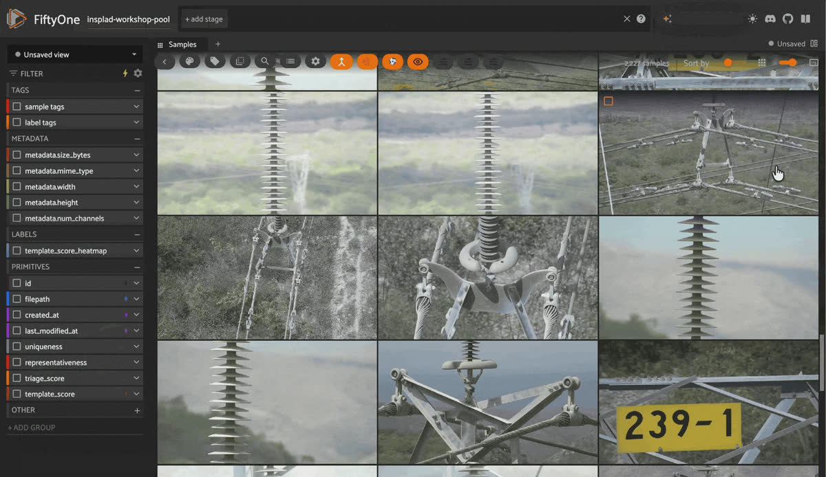
Browsing the unlabeled pool of drone power line images in the FiftyOne App grid
A word on the dataset license. InsPLAD is licensed CC BY-NC 3.0, non-commercial use only. This post respects that. If you’re adapting this workflow for a commercial pipeline, swap in your own data or confirm your dataset’s license.
Random sampling for annotation doesn’t know about class boundaries at all. It just draws images. With four roughly equal classes, it happens to work out reasonably evenly here, but that’s a property of this manufactured example dataset, not something you can assume about an arbitrary dataset.
Most real datasets look nothing like this: some classes show up in a handful of images, others in thousands, and a naive random sample quietly reproduces whatever imbalance already exists in the raw data. The workflow below doesn’t depend on this pool being balanced; it’s designed to work whether your classes are even or wildly skewed, because it decides what to annotate by looking at the images themselves, not by assuming any particular class distribution going in.
Step 0: Download and stage the dataset
Two ways to do this. Pick one.
Fast path: pull the pool straight from Hugging Face Hub. This is the same 1,754-image, media-only dataset, already built:
import fiftyone as fo
from fiftyone.utils.huggingface import load_from_hub

dataset = load_from_hub("harpreetsahota/InsPLAD-workshop-pool")
That’s it. Skip to Step 1.
Full path: build it yourself from the original source. If you want to see exactly how 10,561 raw images become a 1,754-image balanced pool, run the pipeline yourself. It’s four short, deterministic scripts (seed=51, so you get the identical pool every time). Follow the steps in this blog posts accompanying repo here.
Step 1: Load the dataset and verify it’s unlabeled
import fiftyone as fo

dataset = fo.load_dataset("insplad-workshop-pool")  # 1,754 images, media-only
print(dataset.get_field_schema())
The printed schema has no label fields at all, only
filepath, tags, and metadata. Everything from here starts from genuinely unlabeled images.Step 2: Compute embeddings with CLIP
An embedding is a list of numbers, a vector, that captures what’s visually in an image.
A model produces it by looking at the pixels; two images that look alike end up with vectors that sit close together, and two images that look nothing alike end up far apart. That’s what makes it possible to compare, cluster, and search images by what’s actually in them instead of by filename or a manual tag.
Every step from here on- compressing, mapping, searching- needs that ability to compare images to each other. We compute the embedding once, and every downstream step reuses them:
import fiftyone.zoo as foz

model = foz.load_zoo_model("clip-vit-base32-torch")
dataset.compute_embeddings(model, embeddings_field="clip_embedding")
embeddings_field writes the embeddings directly onto each sample. Every brain method below takes an embeddings= argument pointing at that same field, no re-embedding, no reloading the model, just reusing the numbers you already have.Step 3: Find and tag near-duplicate images
Before spending any human attention, find the near-duplicates.
These images come from 14 complete drone-flight sequences, each one a UAV flying past a tower and firing off dozens of frames a second or two apart. Consecutive frames in a sequence like that are often nearly identical, and near-identical images don’t deserve separate annotation budget.
FiftyOne Brain's near-duplicate detection works directly off the embeddings from Step 2: build a similarity index, then ask it to find pairs closer than some distance threshold.
A small similarity threshold (we use cosine distance by default) is a reasonable starting point for CLIP embeddings, tight enough to catch genuinely near-identical frames without flagging merely similar-looking ones. Treat it as a knob to tune against your own data, not a universal constant, and confirm it by reviewing the actual flagged pairs in
duplicates_view() before trusting it:sim_index = fob.compute_similarity(dataset, embeddings="clip_embedding", brain_key="clip_dup_sim")
sim_index.find_duplicates(thresh=0.10)
dataset.select(sim_index.duplicate_ids).tag_samples("near_duplicate")
review_view = sim_index.duplicates_view()Good to know: You can actually use the FiftyOne Brain plugin to find near duplicates right in the app. Just install the plugin: fiftyone plugins download: https://github.com/voxel51/fiftyone-plugins
--plugin-names @voxel51/brainAnd in the FiftyOne App, open the operators browser by clicking the backtick button, and search for the Find Near Duplicates operator.
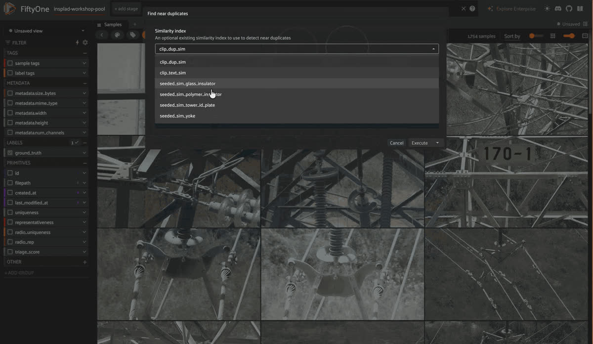
Running the Find Near Duplicates operator from the FiftyOne App operators browser to flag near-identical drone frames
Measured result: 73 of the 1,754 images get flagged, each one paired in
duplicates_view() with the non-duplicate frame it’s closest to, so you can review pairs side by side instead of trusting a single ascending sort. tag_samples marks them; nothing gets deleted yet, and that restraint matters here. In my exploration, I found that 11 of those 73 flagged images are tower id plate, 32 are glass insulator, 30 are polymer insulator, near-duplicates of each other from the same flyby. Deleting on sight would quietly shrink whichever class happens to have the most duplicate-flight coincidences, undoing the balance the pool was built to have. Tagging first and reviewing the pairs lets a human make that call per pair instead of an algorithm making it for the whole pool.Step 4: Visualize the pool with UMAP
With zero labels, you can still ask: does this pool have visual structure? You can visualize the embeddings in FiftyOne by reducing the same embeddings from Step 2 with UMAP, no new embedding computation involved:
fob.compute_visualization(
    dataset,
    embeddings="clip_embedding",
    method="umap",
    brain_key="pool_clip_umap",
)
That call writes the 2D points to the
pool_clip_umap brain run; the actual exploring happens in the App. Open the Embeddings panel, select pool_clip_umap from the brain-run dropdown, and lasso whatever region looks tight and separated from the rest, the App selects those exact samples back in the grid so you can open a few and see what's actually in there: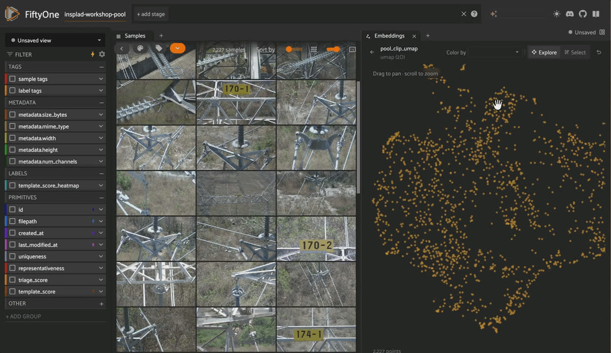
Lassoing a tight cluster in the Voxel51 Embeddings panel UMAP projection of CLIP embeddings to select those samples in the grid
Good to know. This visualization uses no ground-truth labels. You lasso clusters in the embeddings plot blind, then discover what’s actually in them.
You’ll notice that
tower id plate forms a completely isolated cluster with zero overlap with anything else. polymer insulator, glass insulator, and yoke also form their own distinguishable regions, though less tightly separated. Everything else, the various shackles, dampers, and suspensions, blurs together, which makes sense: they really do look alike at a glance.Computing uniqueness and representativeness metrics
How tightly a class isolates in embedding space matters for what comes next: the more visually distinct a class is, the more a handful of seed examples will let you find the rest of it through similarity search alone (Step 6). A class that blurs into everything else needs a different approach, and you won’t know which situation you’re in until you actually look.
While you’re looking at the pool through its embeddings, compute two more numbers that will matter later, once Step 6’s search is done, and it’s time to decide what’s left to annotate:
fob.compute_uniqueness(dataset, embeddings="clip_embedding")

fob.compute_representativeness(
    dataset,
    embeddings="clip_embedding",
    method="cluster-center-downweight",
)
Both scores are just a distance calculation over the same embeddings you already computed in Step 2, no new model, no new pass over the images.
uniquenessmeasures how far a sample sits from its nearest neighbors: high uniqueness means an image looks unlike almost anything else in the pool, an outlier, possibly an edge case, worth a look precisely because nothing similar has been seen yet.representativenessmeasures the opposite: how close a sample sits to the center of a real cluster of similar images, so labeling one representative example teaches a model something about everything else near it too.
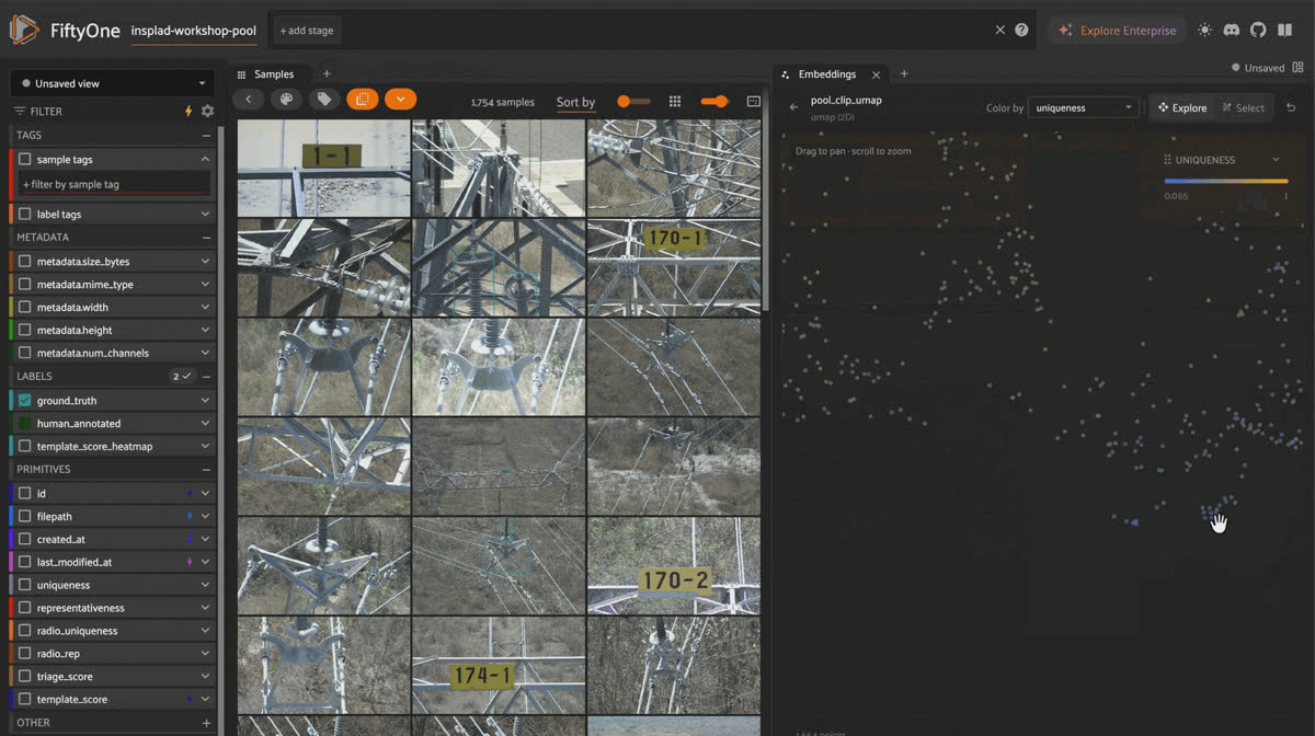
Computing uniqueness and representativeness scores with FiftyOne Brain and sorting samples by score in the App
Neither number needs a single label to compute; both are properties of where an image sits in embedding space, nothing more. They’re what Step 8 blends into a single prioritization score once Step 6’s search has taken its share of the annotation budget.
Before trusting a clean-looking cluster, ask why it’s clean.
polymer insulator’s cluster looked, at a glance, like it might just be “images with the same wooded-hillside background” repeating. It isn’t. The dense region spans 105 distinct drone flights, not a handful, so it’s not one repeated backdrop. But it’s also not simply “isolated, straight-on, close-up shots” either; checking the actual images shows the dense cluster seems to have more objects in frame on average and a smaller relative insulator size than the sparser points. Something about that composition, probably a common “wide tower cross-arm” framing that recurs across many different real towers, is driving the clustering, and it’s genuinely unclear how much of that is CLIP responding to true polymer insulator semantics versus overall scene layout.Keep it honest. Don’t take a clean cluster as proof you’ve found “the” representation of a class; it might just be the easiest-to-photograph mode of it. That’s exactly why Step 7’s
representativeness scoring exists: to make sure your annotation budget doesn’t only ever land on the easy, over-represented composition.Step 5: Test text-based similarity search
Before doing anything more elaborate, try the thing everyone tries first: just search for it in words.
CLIP was trained on image-text pairs, so it can embed a word or phrase into that same vector space the images already live in;
sort_by_similarity then ranks the pool by how close each image’s embedding sits to the text embedding. This is the one place you do pass model= again, not to recompute image embeddings (those come straight from clip_embedding), but because embedding your text query at search time needs the model’s text encoder:fob.compute_similarity(dataset, model="clip-vit-base32-torch", embeddings="clip_embedding", brain_key="clip_text_sim")
text_search_view = dataset.sort_by_similarity(
"tower id plate", k=100, brain_key="clip_text_sim"
)Same query, zero code: open the App, click the search bar above the grid, select
clip_text_sim from the similarity-index dropdown, and type tower id plate directly. The App embeds your text and re-sorts the grid live, with identical ranking: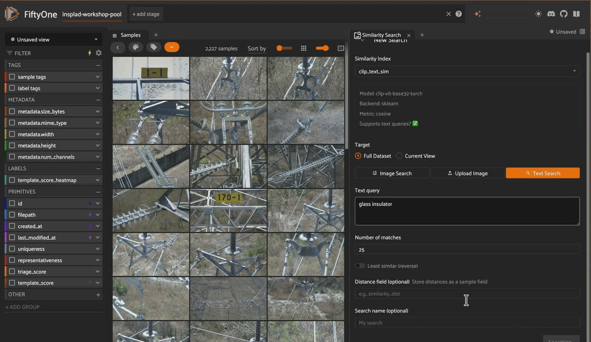
Typing "tower id plate" into the FiftyOne App similarity search bar to re-rank the grid using CLIP text embeddings
Measured result: 25 of the top 100 results actually show a
tower id plate (25%, vs. a 12.9% random baseline). That’s a real lift, roughly 2x random. It’s also nowhere near good enough: 75 of every 100 images you’d review are wasted, and you have no way to know which 25 are the real hits without opening every one.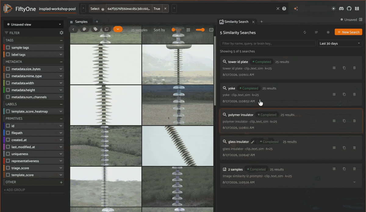
Reviewing the top 100 text search results for tower id plate in the FiftyOne App grid
Run the same query for the pool’s other three classes and the picture gets more interesting, not less:
| Query | Top-100 hits | Random baseline | Verdict |
|---|---|---|---|
| "glass insulator" | 90% | 29.8% | Strong, not quite solved |
| "polymer insulator" | 50% | 30.7% | Real lift, not good enough |
| "tower id plate" | 25% | 12.9% | Real lift, not good enough |
| "yoke" | 32% | 26.2% | Barely better than random |
On initial inspection, it seems like
glass insulator comes closest to a weak prior CLIP already understands: it’s specific, literal, and visually unambiguous, and glass genuinely looks like glass. yoke fares worst for the opposite reason: it’s a generic English word CLIP has seen attached to countless unrelated things, so the text embedding has little to lock onto. The lesson isn’t “text search is weak,” it’s “text search quality depends entirely on whether your class name is a strong, specific visual-lexical match, and you can’t know that without measuring it per class.”Step 6: Search with a few labeled examples instead of a word
Now feed the same function 3 labeled examples of a class instead of a word.
Browse the grid, spot 3 images that clearly show the object, and copy their sample IDs (visible in each sample's modal) into the list below. No new index needed here: clip_text_sim from Step 5 already sits on the same clip_embedding vectors, and a sample-ID query doesn't need the text-prompt capability that index was built for — that's only relevant when the query is a word. Point sort_by_similarity straight at it:
seed_ids = ["<id_1>", "<id_2>", "<id_3>"]  # 3 examples of the class you're searching for

view = dataset.sort_by_similarity(seed_ids, k=100, brain_key="seeded_sim")
The same search, no code required: select the 3 example images directly in the grid (click each thumbnail's checkbox), then choose "Sort by similarity" from the selection actions menu, pick clip_text_sim as the index, and set k to 100. The App runs the identical sort_by_similarity call behind the scenes and returns the same ranked view:
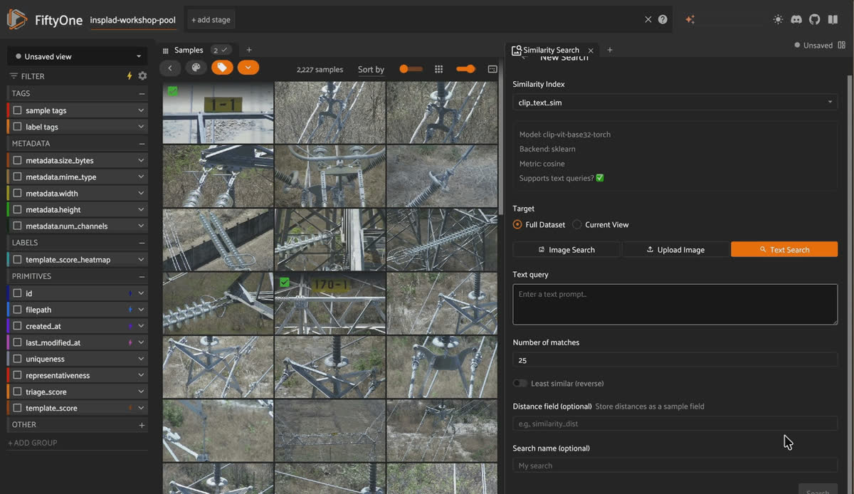
Selecting three example images in the FiftyOne App and sorting the dataset by similarity to those samples
Same function as Step 5, same embedding model, same review budget of 100 images; the only thing that changed is what you fed the query. Run with 3 random true-positive seeds per class:
| Class | Top-100 hits |
|---|---|
| tower id plate | 100% |
| yoke | 68% |
| glass insulator | 54% |
| polymer insulator | 43% |
tower id plate is the dominant subject in nearly every image it appears in, so whole-image similarity search has a strong signal to latch onto. The other three classes are usually one object among several in a busier frame, sharing space with other hardware, which is exactly why whole-image similarity has less to work with for them. Neither text search nor seeded similarity is a universal win here: check both per class, and expect the answer to vary.Review the top-K results in the grid and confirm or reject each candidate before moving on.
Note: As you’re exploring the images and understanding the dataset better, tag the images you want to send for annotation; for example, we will just tag ours as
potential_match. Step 8 needs that tag to know what's already been found, so it doesn't waste annotation budget re-surfacing it.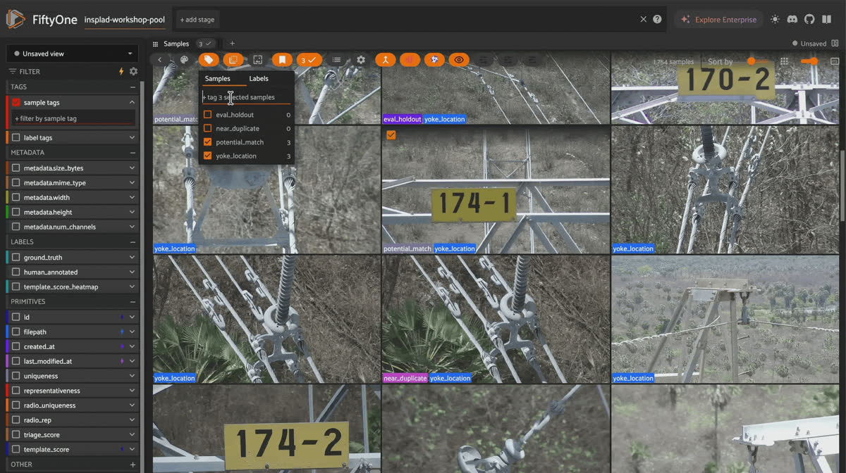
Tagging confirmed candidates as potential_match in the FiftyOne App so later steps skip already-found images
Same idea, zero code: the Crop Query panel.
Crop Query is a FiftyOne panel plugin built for exactly this workflow: few-shot annotation triage from a handful of reference crops, no notebook required. It works a level below whole-image similarity. It slices each image into overlapping patches, embeds each patch, and compares each patch to your reference crops, so it can localize the match rather than just flag that the image probably contains one. That’s especially useful for a class like
yoke or polymer insulator, where the object shares the frame with other hardware and whole-image similarity has less signal to latch onto.fiftyone plugins download https://github.com/harpreetsahota204/crop_queryPoint it at a directory containing 3 example images of your class, cropped tightly around just the object itself (a few seconds in any image editor). Pick
clip-vit-base32-torch as the model, and set the grid to roughly match the object’s scale relative to the frame. Click Run from the panel.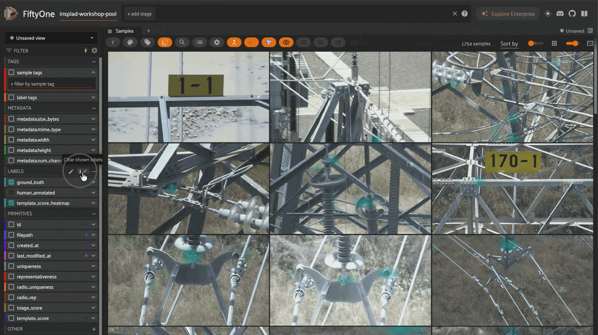
Running the Crop Query panel plugin in FiftyOne with three reference crops to localize patch-level matches with a heatmap
Run it against yoke, and the honest result is a pile of false positives, not a clean win. Makes sense once you think about what a yoke actually is: a small connector piece whose entire job is bolting other hardware together. A patch-level embedding looking at "small metal bracket wedged between two other parts" reasonably confuses it with the shackles and clamps doing the exact same job three inches away. yoke is the overachiever of this dataset, showing up wherever two other objects need to shake hands, and that's precisely the shape Crop Query keeps flagging.
None of this is a knock on the plugin. A small off-the-shelf reference crop and a general-purpose CLIP backbone is a low bar, swap in a domain-tuned embedding model or sharper, more varied crops and this almost certainly tightens up. We didn't do that here, and it's still worth showing: this is a FiftyOne plugin, point, click, get a custom few-shot workflow.
Step 7: Try a second embedding backbone: C-RADIO
Every embedding-based step so far- deduplication, visualization, both similarity searches- ran on CLIP.
CLIP isn’t the only option, and it isn’t automatically the right one for every job. C-RADIO is a different vision backbone, registered here the same way CLIP was in Step 2, and it’s worth checking because different models genuinely see different structure in the same pixels:
import fiftyone.zoo as foz
foz.register_zoo_model_source(
    "https://github.com/harpreetsahota204/NVLabs_CRADIOV3",
)

radio_model = foz.load_zoo_model("NVLabs_CRADIOV3")
dataset.compute_embeddings(radio_model, embeddings_field="radio_embedding")

fob.compute_visualization(
    dataset,
    embeddings="radio_embedding",
    method="umap",
    brain_key="pool_radio_umap",
)
Compare the two visualizations colored by class, and the difference is immediate.
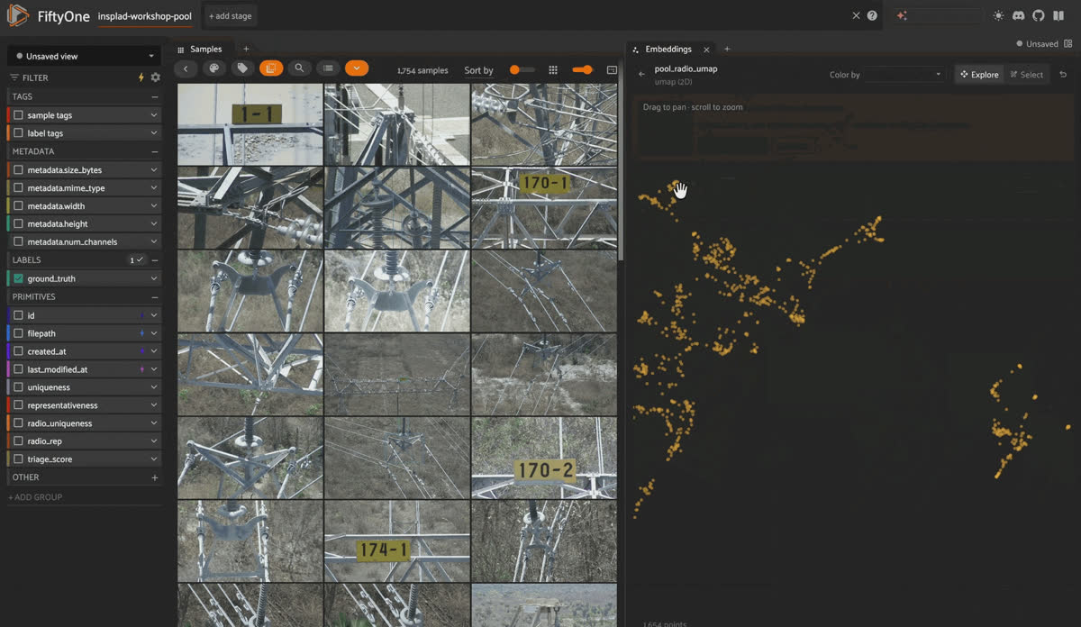
Comparing UMAP projections of CLIP and C-RADIO embeddings side by side in the FiftyOne Embeddings panel
In CLIP’s projection,
yoke collapses into one dense, roughly uniform blob with almost no internal texture. In C-RADIO’s projection, that same region shows real internal structure: visible strands and sub-clusters instead of one undifferentiated mass. tower id plate still isolates cleanly in both. This is a different job than Step 6’s search: not “which class is easiest to find,” but “does this class have internal shape once you’re looking for it, or is it one undifferentiated mass?”Keep it honest. “Different-looking plot” isn’t evidence on its own, so this gets measured the same way everything else in this post does. Score both uniqueness and representativeness a second time, this time against the C-RADIO embeddings:
fob.compute_uniqueness(dataset, embeddings="radio_embedding", uniqueness_field="radio_uniqueness")

fob.compute_representativeness(
    dataset,
    embeddings="radio_embedding",
    representativeness_field="radio_rep",
    method="cluster-center-downweight",
)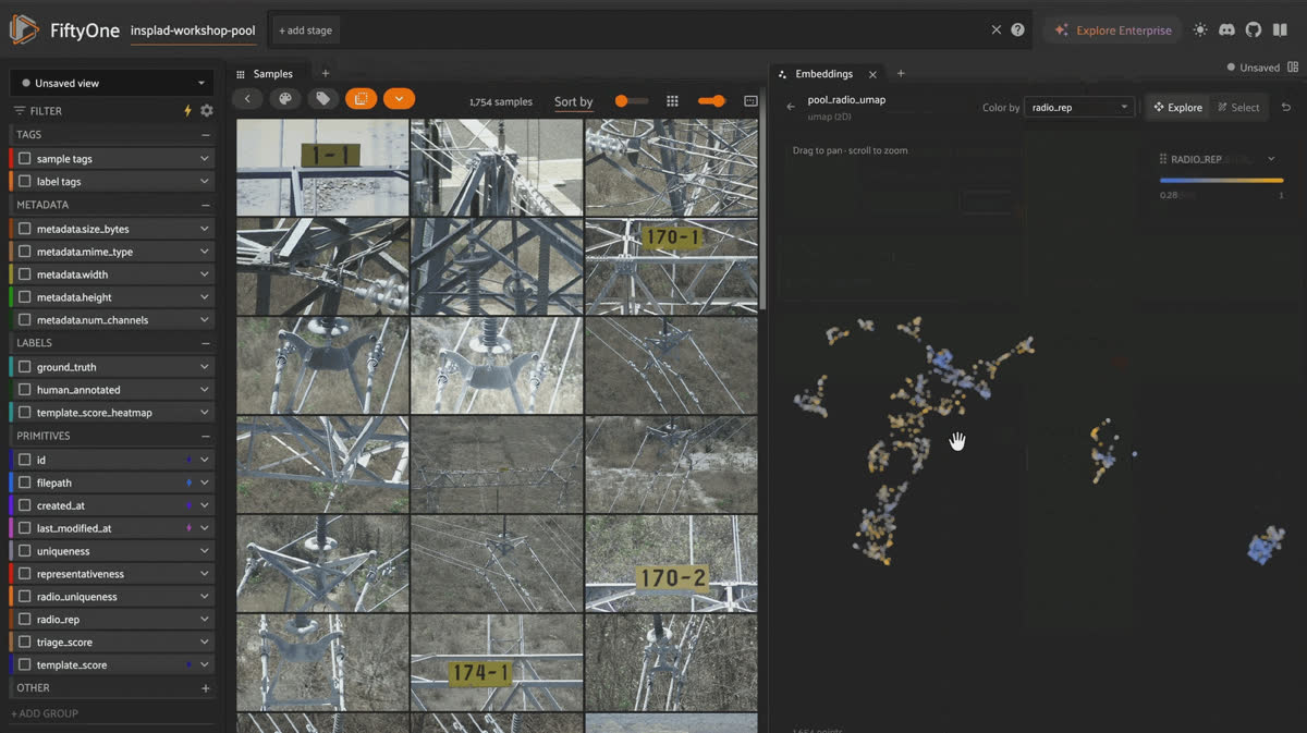
Scoring uniqueness and representativeness a second time against C-RADIO embeddings in FiftyOne
CLIP and C-RADIO agree reasonably well on which images are outliers, but they disagree more on which images are “representative” of a cluster, exactly where a model’s sense of visual structure would matter most.
Step 8: Prioritize what’s left with all four signals
“A large unlabeled pool” actually turns into “a small, high-value annotated set” here.
Step 6’s search found more of what you already knew to look for; this step fills in what it couldn’t, by blending signals across the rest of the pool into one triage score. With two embeddings now in play, that’s four signals instead of two:
import numpy as np

def minmax(a):
    a = np.array(a)
    return (a - a.min()) / (a.max() - a.min())

not_yet_found = dataset.match_tags("potential_match", bool=False)

triage_score = (
    0.25 * minmax(not_yet_found.values("uniqueness"))
    + 0.25 * minmax(not_yet_found.values("representativeness"))
    + 0.25 * minmax(not_yet_found.values("radio_uniqueness"))
    + 0.25 * minmax(not_yet_found.values("radio_rep"))
)
not_yet_found.set_values("triage_score", triage_score.tolist())

hot_queue = not_yet_found.sort_by("triage_score", reverse=True)
uniqueness and representativeness were introduced back in Step 4, computed once against CLIP; Step 7 computed them a second time against C-RADIO. Now there are two independent readings of each, one per embedding, and blending all four gives the triage score more to go on than either embedding alone.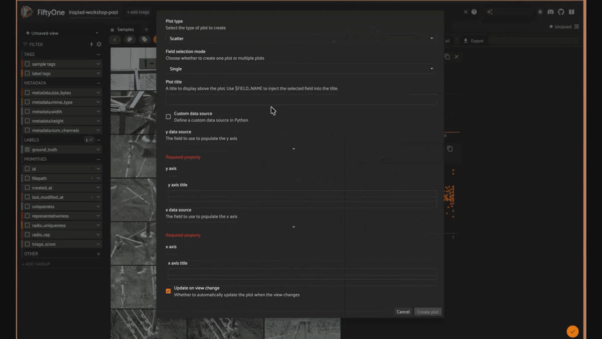
Sorting the remaining pool by blended triage score in the FiftyOne App to build the annotation hot queue
Keep it honest. Excluding already-found candidates is necessary. Blend all four signals across the whole pool without filtering first, and the triage score quietly re-surfaces images Step 6 already tagged potential_match: 2% of the naive blend's top 100 lands on already-found ground. dataset.match_tags("potential_match", bool=False) fixes it directly by excluding hits before ranking, rather than trusting the score to sort them lower. That one line brings the overlap to 0%. The effect is modest here, this pool's balance keeps any single signal from dominating, but the lesson scales: the larger and more skewed your own pool, the less you can assume a blended score respects what an earlier step already found.
Whatever survives this triage is what you actually sit down and annotate next.
Step 9: Annotate in the FiftyOne App
Every step so far has been code. This one isn’t, and it shouldn’t be: drawing a box is a visual task, and FiftyOne’s in-App annotation does it directly on the samples you’re already looking at, no export to a separate labeling tool and back. Before anything in the App can be edited, the field you want to label needs an Annotation Schema.
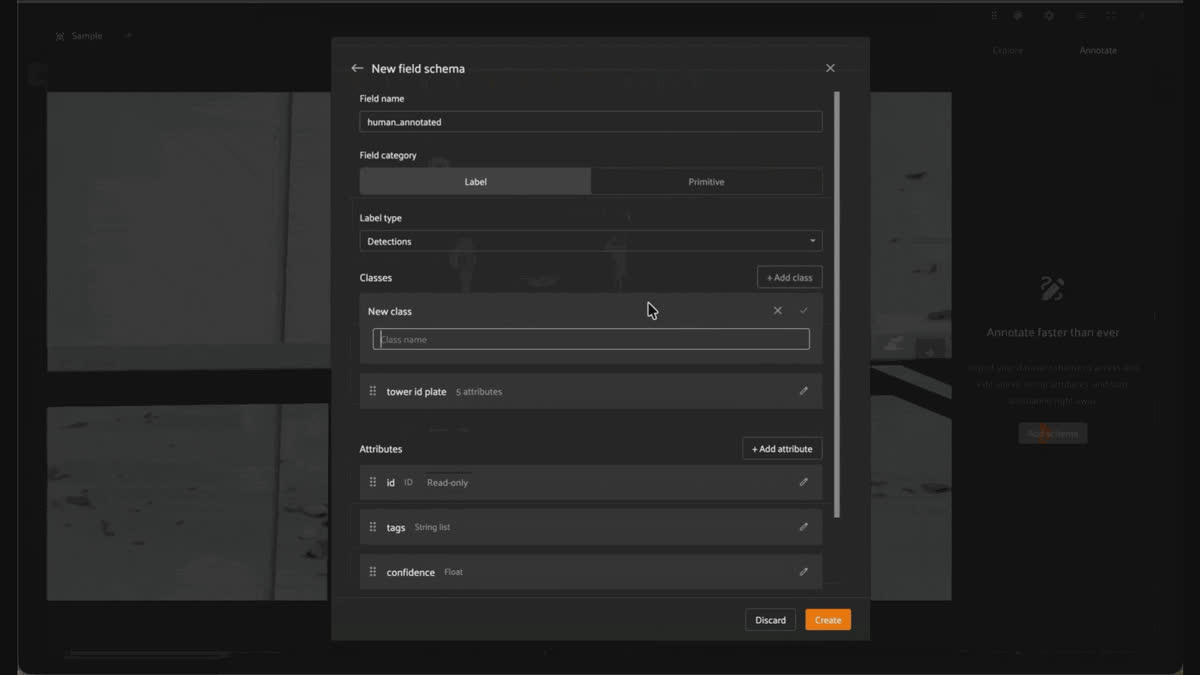
Adding human_annotated as a Detections field with four classes in the FiftyOne App Schema Manager
This is a one-time setup per dataset, not per image: open any sample’s expanded view, go to the new “Annotate” tab, and use the Schema Manager to add
human_annotated as a Detections field with the 4 classes from this walkthrough (tower id plate, polymer insulator, glass insulator, yoke). The name matters: ground_truth is reserved for the 100 held-out samples from Step 0, whose real labels you deliberately haven’t seen yet. Everything you draw by hand in this step goes into human_annotated instead, so the two never get confused later when you fine-tune or evaluate. Only fields present in the schema show up as editable here; if you’d rather skip schema setup entirely, hover over a field in the “Explore” tab and click its pencil icon to have the App impute a schema for you on the spot.With the schema in place, working the hot queue looks like this for each sample:
- Open the sample’s expanded view and switch to the “Annotate” tab. You’ll see the Annotation Canvas (the image, for interacting with labels directly), the annotation actions toolbar (for creating new labels), and a flattened list of label instances below it.
- Click “Create new detection” in the toolbar. The cursor becomes a crosshair; click and drag across the object to draw the box.
- Pick
human_annotatedas the field, and the correct class from the dropdown; both are required to save. If Crop Query flagged this sample in Step 6, its heatmap already told you roughly where to drag. - Resize or reposition the box afterward by dragging its edge or corner handles, either on the canvas or numerically in the right sidebar (useful for pixel-precise adjustments a mouse can’t reliably make).
- Move to the next sample. There’s no explicit “save” step: changes auto-save to the dataset as you work, with a small indicator showing save-in-progress vs. saved.
Ctrl/Cmd+ZandCtrl/Cmd+Yundo and redo within the current session if you misclick.
That’s it, the annotations land directly in the
human_annotated field, distinct from the ground_truth you’re still holding in reserve. Nothing to export, convert, or re-import before the next step.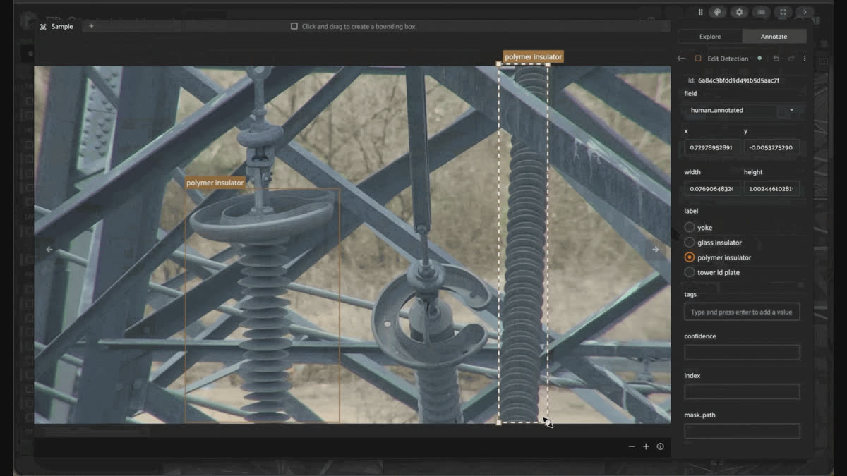
Drawing, resizing, and classifying a detection box in the FiftyOne App Annotate tab with changes auto-saving
With
triage_score computed and the dashboard built, the actual selection happens by hand in the App, not by taking the literal top-N from a single sorted list. The scatter plots are the flexible tool here: lasso a region and the view narrows to just those samples. The histogram is the opposite: useful but coarse; it selects only one bar at a time, so it works best as a last pass within a view the scatter plots have already narrowed, not as the starting filter.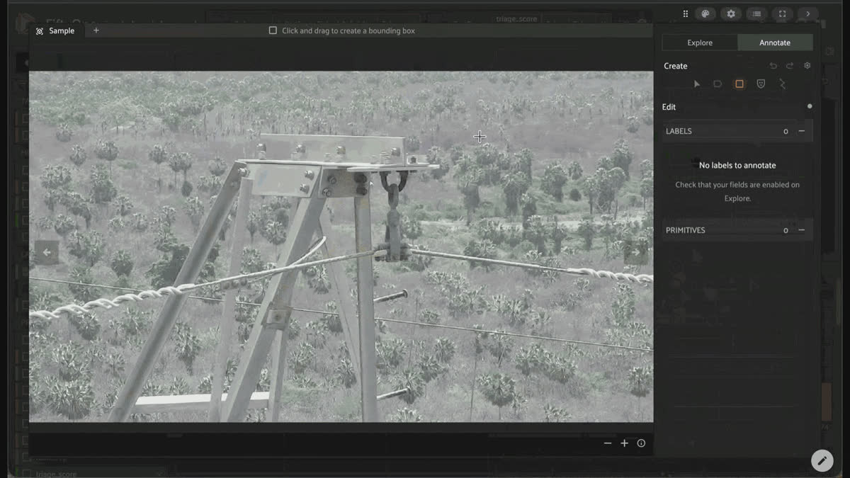
Lassoing selection lanes in Voxel51 Dashboard scatter plots of CLIP and C-RADIO uniqueness and representativeness, narrowing the grid to a triage-sorted annotation queue
Two lanes worth carving out deliberately, instead of letting one linear blend average them away. The first: the off-diagonal points in the CLIP-vs-C-RADIO scatter plots, where the two backbones disagree. These are exactly the samples C-RADIO's presence in the blend is for; a CLIP-only triage would rank them differently, sometimes lower than they deserve. The second: the same-backbone plots (CLIP uniqueness vs. CLIP representativeness and the C-RADIO equivalent), used to select a deliberate mix of true outliers (high uniqueness, low representativeness) and safe cluster picks (the reverse), rather than letting
triage_score’s equal weighting silently decide that ratio.Lasso a lane, check the histogram within it to further narrow if needed, then move to the next lane. Combine what survives, exclude anything already tagged potential_match, and that's the set that goes to annotation:
Step 10: Fine-tune a detector with RF-DETR
Whatever you annotated in Step 9 is exactly the small, high-value labeled set this whole workflow exists to produce. Turning it into a model is deliberately not the hard part; it’s plumbing. We fine-tune
Roboflow/rf-detr-base on the prioritized examples using the finetune_detection operator from the hf_fine_tuner_plugin:import fiftyone.operators as foo
from fiftyone import ViewField as F
det_trainer = foo.get_operator(
"@harpreetsahota/hf_fine_tuner_plugin/finetune_detection"
)
det_trainer(
dataset.match(F("human_annotated.detections").length() > 0),
label_field="human_annotated",
model_name="Roboflow/rf-detr-base",
bbox_format="coco", num_epochs=75, learning_rate=5e-5, batch_size=16
delegate=True,
)You can also kick this off in the App:
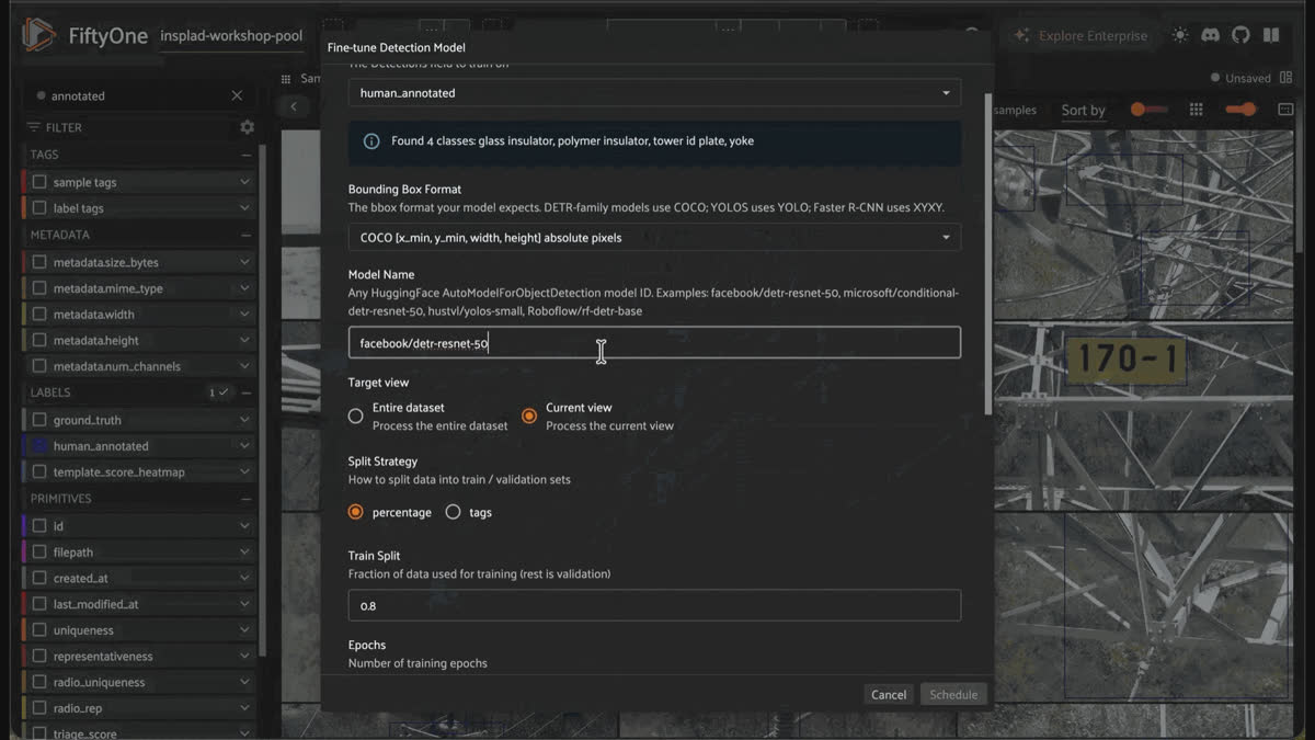
Launching RF-DETR fine-tuning from the hf_fine_tuner_plugin operator in the FiftyOne App action menu
Training reads
human_annotated, never ground_truth. The held-out labels stay untouched by the model at every stage until Step 12, which is the whole point of holding them out. No export to a training script, no separate CLI, no re-import step. The operator runs delegated in the background, and the App stays responsive.Good to Know. The plugin's defaults (3 epochs, learning_rate=1e-5) assume the pretrained checkpoint's classification head already roughly matches your classes (It doesn't here).
RF-DETR ships pretrained on 91 COCO classes, and fine-tuning on these 4 reinitializes that head from scratch, so it needs more signal to learn from than a lightly-adapting head would.
5e-5 is a defensible middle ground, high enough to actually move a freshly initialized head, but not so high as to destabilize the pretrained backbone. Epochs matter even more than they sound: RF-DETR, like other DETR-family detectors, matches each image's ground-truth boxes to only a handful of its ~300 query slots (via Hungarian matching), so only those few queries receive a real gradient signal per step. That sparsity means these models typically need several hundred to a couple thousand total optimizer steps to converge, not the roughly 60 steps 3 epochs gets you at this pool's annotated-sample count. 75 epochs at batch_size=16 works out to about 1,350 steps, comfortably in that range, and a first attempt at fewer epochs confirmed the difference directly: train loss plateaued around 39 and never dropped further, versus ~2.5 with this configuration.
None of this is a rule to apply blindly, though; it's specific to fine-tuning a pretrained detector with a reinitialized head on a few hundred images, and the operator already does real work to protect against overshooting: eval_strategy="epoch" with load_best_model_at_end=True evaluates every epoch and keeps whichever checkpoint scored best on validation loss, here, that was epoch 17, well before the end. More epochs cost training time, not model quality.
Step 11: Spot-check the model on what it hasn’t seen yet
Step 10’s checkpoint has only ever seen the samples you happened to annotate. Before trusting it with anything else, run it over everything you haven’t annotated yet and look at the same interactive-scoped, eval_holdout-excluded pool every step in this walkthrough has used:
from transformers import AutoModelForObjectDetection
not_yet_annotated = interactive.exists(“human_annotated”, bool=False)
model = AutoModelForObjectDetection.from_pretrained(“finetuned_detection_model”) # wherever finetune_detection saved its output_dir
not_yet_annotated.apply_model(model, label_field=“predictions”, confidence_thresh=0.5)
Keep it honest. RF-DETR always emits a fixed number of query predictions per image (300 here), most of which are near-zero-confidence noise from queries that found nothing. Skip
confidence_thresh, and predictions end up including all 300, burying the handful that are real. 0.5 is a reasonable starting cutoff, not a magic number; tune it against what you actually see in the grid.There’s no
ground_truth out here to score against, so this isn’t a metric, it’s a vibe check: open the App and scroll the predictions class by class, looking for where the model is confidently wrong, or confidently silent. tower id plate, the class with the tightest embedding cluster and the most annotated examples, is the likeliest to already look solid; yoke, the overachiever that rides along in everyone else’s frame, is the likeliest place to find a real gap.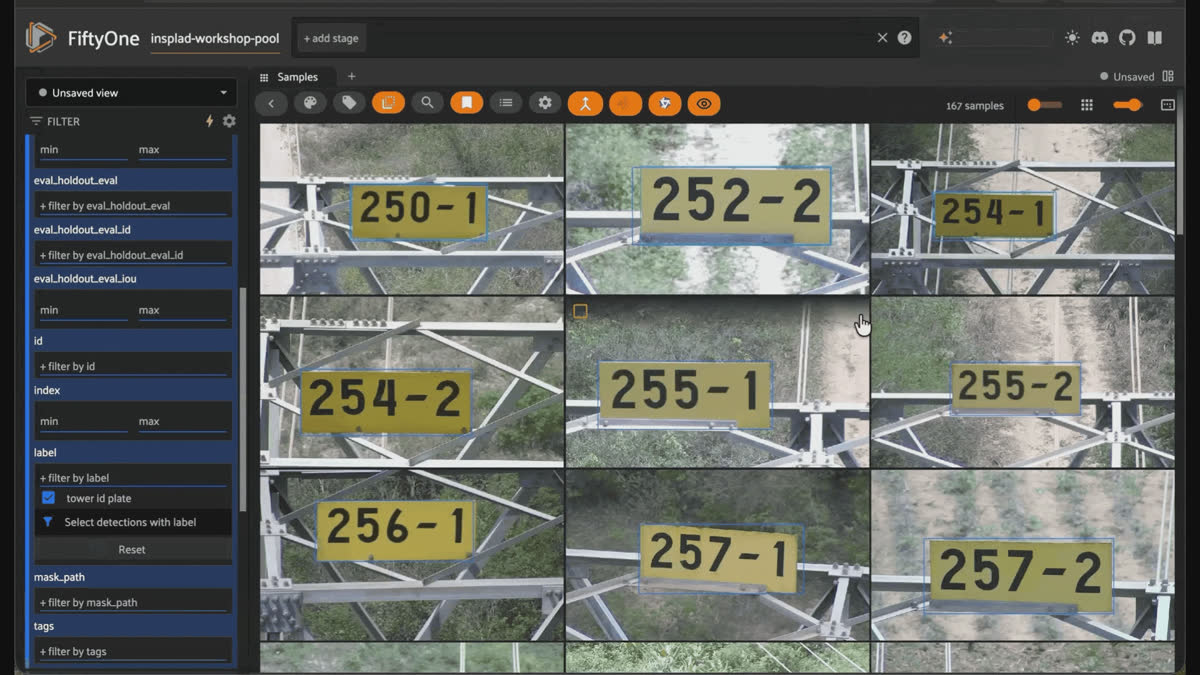
Scrolling fine-tuned RF-DETR predictions class by class in the FiftyOne App to spot-check for confident misses
Where a class looks weak, the fix is exactly what Step 9 already does: open a few more of those samples in the Annotate tab, draw the real boxes into
human_annotated, and re-run Step 10’s finetune_detection call, same operator, same field, just a larger human_annotated set underneath it this time. Repeat that vibe-check-and-annotate loop, one class at a time, until every class’s predictions look plausible enough to trust, not until they’re perfect; that’s a judgment call you make by looking, not a threshold you compute.Step 12: Evaluate against the held-out labels
Once you’re satisfied with Step 11’s coverage, whichever round of the checkpoint that leaves you with, it’s time for the one step in the whole workflow that touches ground_truth. 08_reveal_eval_holdout_ground_truth.py does the reveal: it loads the real boxes from heldout_ground_truth.json into a ground_truth field, but only on the 100 samples tagged eval_holdout, and scoped to just the 4 classes this walkthrough annotates and trains on. InsPLAD-det ships 11 fine-grained classes total; the other 7 (stockbridge damper, yoke suspension, and the shackle variants) get dropped rather than loaded- 222 of the raw 354 boxes in this case- because scoring a model against objects it was never trained to detect would corrupt precision and recall for no reason. The result is saved as an eval_holdout_annotated view, a click away in the App from here on. Run inference on that view and evaluate:
eval_view = dataset.load_saved_view("eval_holdout_annotated")
eval_view.apply_model(model, label_field="predictions")
results = eval_view.evaluate_detections("predictions", gt_field="ground_truth")
results.print_report()
Measured result, on this pool’s 100-sample holdout:
| Class | Precision | Recall | F1 |
|---|---|---|---|
| tower id plate | 1.00 | 0.92 | 0.96 |
| polymer insulator | 0.83 | 0.53 | 0.65 |
| glass insulator | 0.92 | 0.30 | 0.45 |
| yoke | 0.57 | 0.12 | 0.21 |
The same numbers are one click away in the App, too: open eval_holdout_annotated and the Model Evaluation panel for a confusion matrix and per-class precision/recall, no code required to look at what
print_report() just printed.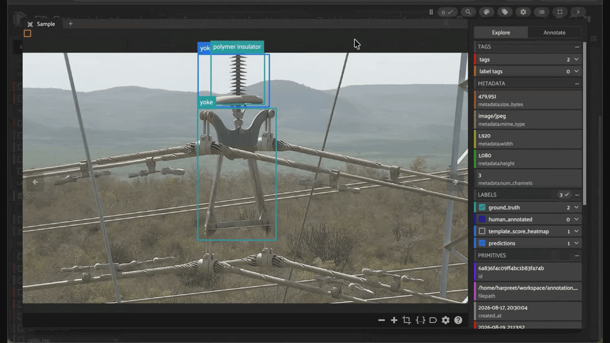
Reviewing per-class precision, recall, and the confusion matrix in the FiftyOne App Model Evaluation panel on the held-out set
The pattern here isn’t a surprise if you were paying attention earlier: tower id plate, the one class with a fully isolated embedding cluster and the strongest search hit rate all the way back in Step 6, generalizes best. yoke, the class that kept showing up as the hardest case, in the search step, in Crop Query’s false positives, in C-RADIO’s clustering, comes out weakest here too, low recall in particular, meaning the model is still missing more yoke instances than it should. That’s not a coincidence; it’s the same underlying property of the class (it rides along in someone else’s frame, sharing its shape with shackles and clamps) showing up at every step of this workflow, search, prioritization, and now evaluation alike.
Because the holdout was carved out before annotation ever started (Step 0) and stratified across all 4 target classes, this number reflects real generalization rather than memorization of the images you happened to label. Whatever classes or embedding regions score worst here are, by construction, your next hot queue, yoke, concretely, in this run. That’s the whole loop, and it doesn’t stop here: compress, map, search, prioritize, annotate, fine-tune, review, evaluate, then go again on whatever’s still uncovered.
One more thing: Agentic Labeling with Voxel51
Everything above runs on open-source FiftyOne. If this loop is something you run on a new dataset every week instead of once, Voxel51 has a feature aimed squarely at the one step in this walkthrough that’s still genuinely tedious: drawing every box by hand in Step 9.
Agentic Labeling (Enterprise, currently Beta, requires a running Agentic Labeler service) replaces manual box-drawing with a prompt-driven vision-language model. Instead of a fixed model with a fixed class list, you write a plain-language prompt describing what to label, for
tower id plate that might be “a small rectangular identification placard mounted where the tower’s cross-arm meets the pole,” pick a task (Classification, Detection, Caption, or a region variant for labeling individual objects one at a time), and optionally add up to 5 positive and 5 negative example images to sharpen its behavior. You test the agent on a handful of grid samples before committing to anything, and those test previews are never written to your dataset; only an explicit Run persists labels. That’s the same “nothing happens by accident” property this pool has had since the cold start in Step 1, just applied to labeling itself.Point it at the hot queue from Step 8 with the Detection task, and a prompt tuned to
tower id plate, and what comes back isn’t a finished label set; it’s a fast first pass: boxes you review and correct in the grid instead of drawing from nothing. That’s a direct upgrade to Step 9, and it doesn’t change anything downstream; the labels it produces feed Step 10’s fine-tuning exactly like hand-drawn ones would, just faster to produce in the first place.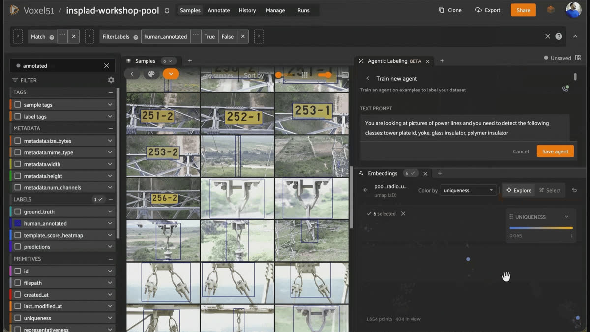
Agentic Labeling in Voxel51 generating first-pass detection labels from a plain-language prompt for review
Try it yourself
harpreetsahota/InsPLAD-workshop-poolon Hugging Face: the exact 1,754-image pool used in this post (load_from_hub()and go), plus the download-sample-import scripts behind it if you want to rebuild it from source- InsPLAD dataset and paper (CC BY-NC 3.0): original source, full 10,561-image detection set
- Crop Query: the no-code panel for Step 6’s search step
Roboflow/rf-detr-baseon Hugging Facehf_fine_tuner_pluginfor FiftyOne- Agentic Labeling docs (Voxel51)
Frequently Asked Questions
10,561 images is InsPLAD-det’s full extent; 1,754 is a deliberately stratified sample of it, built by 02_build_workshop_pool.py (seed=51, so it’s identical every time you run it). A naive random subsample would break the workflow in two ways: dedupe first, and there’s no wall left for Step 3 to find; and a random subsample would reproduce whatever class imbalance already exists in the source data instead of giving every class a fair shot at the annotation budget. The design keeps a balanced, capped quota for all 4 target classes (tower id plate’s natural ceiling of 242 images sets that quota, since it’s the least common class overall), whole intact duplicate-flight sequences, and long-tail texture, so every step still has something real to show, at a fraction of the data.
The paper’s total counts 46 COCO image_id entries that share a file_name with another entry: the same physical image, annotated across two separate JSON records with disjoint boxes. We merged these into a single sample per file during import, which is why the unique image count is 46 lower than the paper’s reported figure. Total box count (28,959) is close to, but not identical to, the paper’s 28,933; the remaining gap is a 26-instance sphere category present in the source annotations but not listed in the paper’s per-class table.
No. Computing embeddings, finding near-duplicates, visualizing the pool with UMAP, and scoring uniqueness and representativeness all run on completely unlabeled data. insplad-workshop-pool genuinely has zero label fields until the final reveal step. You only need labels once you get to the seeded similarity search step, and even there, 3 examples is enough to start.
Because whether it works at all depends entirely on the class, and you can’t tell in advance. On this pool, “glass insulator” gets 90/100, strong but not solved. “polymer insulator” gets 50/100, a real lift but nowhere near reliable. “tower id plate” gets 25/100, a real lift over its 12.9% random baseline but not trustworthy on its own. “yoke” gets 32%, barely above its own 26.2% random baseline.
Searching with 3 labeled examples instead of a word changes the ranking, but not uniformly for the better: tower id plate 100%, yoke 68%, glass insulator 54%, polymer insulator 43% (3 random true-positive seeds each). It doesn’t depend on CLIP associating your class name with the right pixels, as text search does, but its ceiling still depends on how visually distinctive the class’s embedding cluster is (see Step 4). tower id plate is the only class with a fully isolated cluster, which is exactly why it hits 100% here and the others don’t. Check both text search and seeded similarity per class; neither one is a safe default on its own.
For tower id plate, either works well: the class is the dominant subject in almost every image it appears in, so whole-image and patch-level embeddings agree. The real difference shows up in classes that share the frame with other hardware, like several of InsPLAD’s shackle classes, or in the yoke and polymer insulator in the images, which aren’t the primary subjects. Whole-image similarity has less signal to latch onto there, but patch-level matching (Crop Query’s approach) still has a shot, because it’s comparing your reference crop against individual regions, not the whole scene. Crop Query also gives you a heatmap either way, which sort_by_similarity doesn’t.
Because they answer different questions. Sorting by uniqueness alone chases outliers: interesting, but a single one-off doesn’t teach a model much about the rest of the pool. Sorting by representativeness alone keeps re-picking near the same cluster centers: safe, but redundant past the first few. Blending them (and using cluster-center-downweight, which penalizes picking near-duplicates of already-high-scoring points) gives you a queue that’s simultaneously non-redundant and reasonably central to real clusters. On this pool, the CLIP-based versions of the two signals correlate at 0.47, related but far from redundant, so blending them is combining real information, not double-counting the same thing.
Because CLIP and C-RADIO don’t agree on everything, and the disagreement is where the extra signal lives (see Step 7 for how much they agree on this pool). But blending is not automatically safe: doing it across the whole pool without excluding already-found candidates lets the hot queue re-surface images Step 6 already handled (see Step 8). More signal isn’t free; it still needs to respect what earlier steps already handled.
Two things, independently verifiable before you commit to a project or a production pipeline: it should form a visually distinct cluster in embedding space (so similarity search has signal to work with), and it should be the dominant subject in most of the images that contain it (so whole-image embeddings, not just cropped patches, carry that signal). tower id plate passes both tests in InsPLAD; several of the shackle classes, and yoke and polymer insulator in some of their images, fail the second one because they’re usually one object riding along in a frame dominated by something else.
Three fields, three distinct roles, and the workflow only works if they stay separate. human_annotated is what you draw by hand in Step 9, on the samples the triage queue prioritized; it’s real labels, but only on a small slice of the pool. ground_truth is InsPLAD’s original expert annotation, reserved exclusively for the 100-sample holdout carved out in Step 0 and never shown to you or the model until Step 12. predictions is the fine-tuned model’s output, applied in Step 11, and it’s the one field that’s never assumed correct; that’s the entire reason the review step exists. Mixing up human_annotated and ground_truth would either leak the evaluation set into training or leave you unable to score generalization at all; keeping them separate is what makes Step 12’s number trustworthy.
Hacker-in-Residence
Harpreet is Hacker-in-Residence at Voxel51, where he turns cutting-edge AI ideas into open-source prototypes and demos that push the boundaries of deep learning. From building tools that inspire to creating content that educates, Harpreet helps the AI community level up—one wild idea at a time.
See all articles by Harpreet Sahota
Try Voxel51 for yourself
Loading related posts...
© 2026 Voxel51 All Rights Reserved


